Rebuilding my portfolio site in Gatsby.js
March 28th 2020
(View the Github repo for this site)
TLDR: Gatsby.js + Sanity.io + Netlify + Styled-Components + Framer Motion
Introduction
After completing the FreeCodeCamp Full-Stack Developer curriculum and building a handful of full-stack apps over the last few months, it was time for me to rebuild my portfolio site with a modern Javascript stack before applying for jobs.
I built my older v1 portfolio site (which you can find archived here) using Jekyll and SASS before I learned React. Jekyll is a pretty sweet static site generator (SSG) which first introduced me to a component-based architecture with its include tag and layouts. As the most popular SSG prior to the React-era, Jekyll is in a way the OG JAMstack framework. History aside, after learning React, I wanted to rebuild my portfolio with the powerful new tech in the modern React ecosystem.
Choosing a tech stack
When I began my journey into learning frontend development full-time back in November 2019, I used the Frontend Developer roadmap from roadmap.sh to help decide what langauges, libraries, and frameworks to learn. Following the roadmap and the general chatter in the JS developer world, I focused on using Gatsby.js and Next.js as frameworks for building my React apps and sites.
Next and Gatsby are clearly the leading frameworks in the React ecosystem, both offering:
- Blazing fast performance
- Single-page-app out of the box
- SEO-friendliness
- Amazing developer experience
Here is a good article going more in depth on this comparison.
Ultimately I chose to use Gatsby.js for my portfolio as it is optimized for pure static site generation, is more opinionated about data handling and offers a larger ecosystem of plugins for things like optimizing image loading and sourcing data from a CMS.
This leads me to choosing the other main layer of this site's stack, the CMS. Previously, while building visiteggharbor.com, I did some research on the wide range of options in the headless CMS space and after playing around with a few options I arrived on Sanity.io. I was super impressed with Sanity's onboarding tutorial for Gatsby and it continued to please as I developed the site and customized the CMS editor. A few features that make Sanity stand out from the crowd of CMSs:
- Great documentation and amazing developer experience
- Ability to endlessly customize Sanity Studio, the open-source, React-powered backend editor
- Generous free tier suitable for hobby projects
For these reasons I chose to use Sanity.io as the headless CMS for my portfolio site. In this project, Sanity provides the data for each of my projects, blogs posts, and content of certain pages in JSON format and Gatsby builds individual pages off of this data, which is super slick. Sanity plays really well with Gatsby using the gatsby-source-sanity plugin.
Styling
In terms of styling, I used Styled-Components as I prefer the CSS-in-JS approach to styling. One of my favorite things about Styled-Components is its <ThemeProvider/> wrapper component which uses React's context API to provide all React components underneath itself a theme prop. I use this in tandem with use-dark-mode and react-toggle to enable dark mode functionality across the site.
To achieve the fluid animations for certain user interaction, I used Framer Motion, an open-source animation library for React. I found Framer Motion to make it very easy to animate things like menus and buttons and it even played nicely with Styled-Components.
Deployment
The beauty of developing a JAMstack site is that the site can be built to all static assets and served on a global CDN, providing blazing fast load-times and a very low cost of deployment. I deployed this site on Netlify which is a very developer-friendly JAMstack deployment platform. With Netlify you simply connect your Github repo, configure some domain and build settings and then Netlify will automatically run your site through a CI/CD pipeline and redeploy it to their CDN.
(View the Github repo for this site)
Performance, accessibility, and PWA
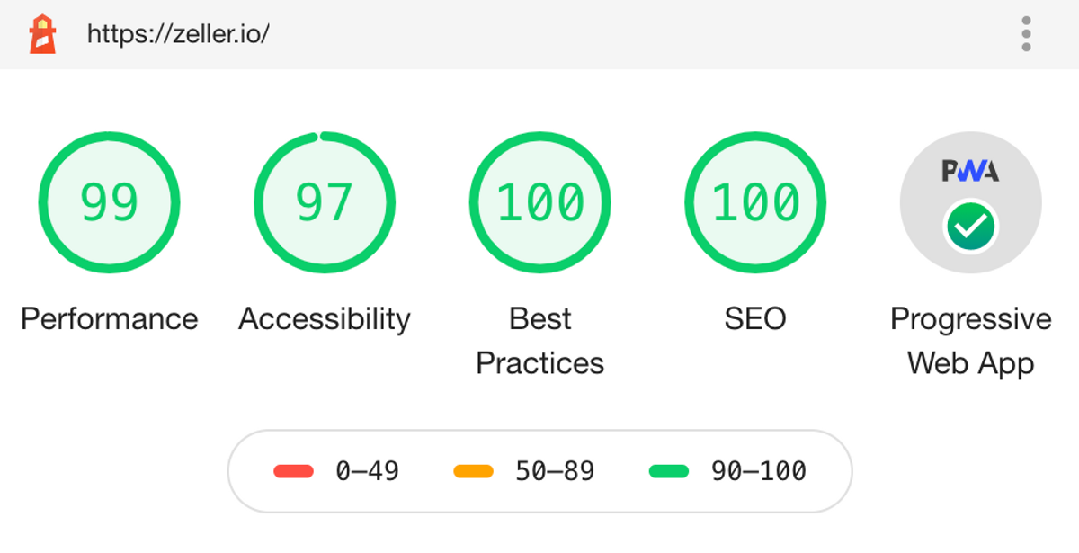
I used Google's Lighthouse Audit tool from within the Chrome Dev Tools to measure the performance, accessibility, SEO and progressive web app (PWA) characteristics of this site. This helped me to identify gaps in these areas that I could fix like adding alt props that were missing from link elements and improving link text to be more descriptive. I am fairly content with all sections in the > 90 range. You can see the results for this site after improvements below:

By default, Gatsby makes it very easy to hit high scores in the performance section by pre-building pages that are served on a CDN and offering features that help time-to-first paint like lazy-loading images. With the additional of a few Gatsby plugins, I unlocked full progressive web app functionality on my site:
- I enabled automatic HTTPS on Netlify, forcing HTTPS for all traffic
- I added gatsby-plugin-manifest to enable and configure a web app manifest, which is a part of the PWA specification.
- I added gatsby-plugin-offline which adds drop-in support for offline functionality.
The result is that the site acts as a PWA. Users can add the site to their home screen where upon reopening, it behaves like a native app and can be fully navigated when offline.